Review: Tracks – Toybox Edition (Nintendo Switch)
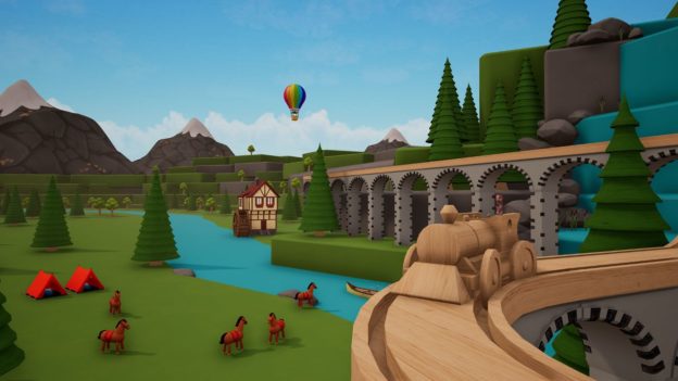
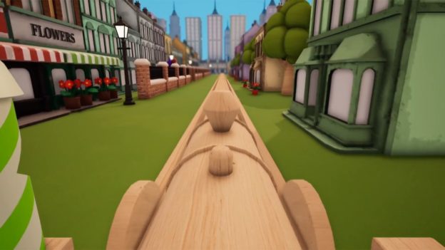
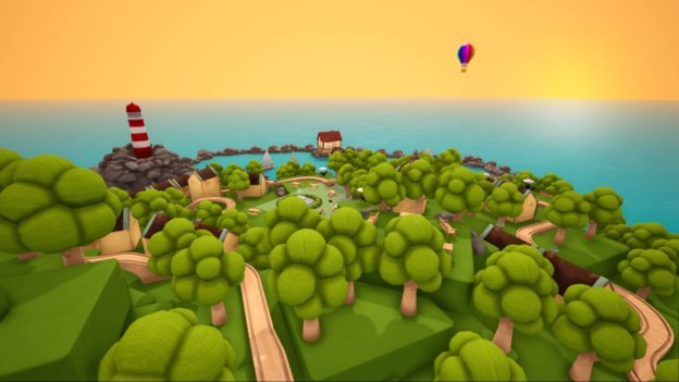
It was a late arrival, but I was happy to redeem our Tracks – Toybox Edition review code. As someone who had a train set as a kid, I wanted to “Jump into the ultimate toy sandbox and build the train set of your dreams!” Unfortunately, this game is in danger of getting derailed.
Things got off to a bad start with the weak tutorial. The first message I got was “Hold the Right Button to move through the tutorial.” But when I clicked the R button, it brought up a scenery menu with buildings, decorations, and more. ZR laid down pieces of track, and the Right stick zoomed out. Finally, I used the directional buttons on the left Joy-Con to advance. Oh, and the tutorial only seems to be accessible the first time you start the game. Beyond that, your option is to pull up a static control screen and see how every button is used.
What is it about train games and lousy tutorials? Lionel City Builder 3D: Rise of the Rails, Mini Trains, and Railway Empire are a few that come to mind. The difference is those are all good games. Tracks – Toybox Edition, in its present state on the Nintendo Switch, is not.
Suffice to say, my enthusiasm for building waned. Beyond the substandard tutorial, the UI was unintuitive. I say that with confidence based on how often I had to study the control screen during my early play. These aren’t minimal issues for a game almost entirely about building and creating tracks and small worlds for your trains to travel through.
Thankfully Tracks – Toybox Edition has another mode, “Passengers,” a puzzle mode where you collect passengers from a platform and drop them off. It feels like a bit of an afterthought but is a good option for those with limited interest in making tracks. But even accessing this was a needless challenge. The section is greyed out until you select an environment that this mode is compatible with.
Adding insult to injury, this game does not support the touchscreen in any way, shape, or form! To call this careless is putting it mildly. Imagine Super Mario Maker (with even more small icons) minus touchscreen support. It’s such a missed opportunity and sealed my adverse impression of Tracks – Toybox Edition. It’s a shame because, as the trailer shows, there are a lot of possibilities for those willing to suffer through it. Not that there’s a way to share creations.
Perhaps the best thing I can say about this title is that I dig its jazzy piano music. It’s relaxing, even when I’m viewing my most modest creations from multiple camera views. The tracks for the various environments (apartment, bedroom, and moon) are all pleasant.
Excalibur Games has serious work ahead if they want to make Tracks – Toybox Edition a good game for the Nintendo Switch, especially if targeting whole families. Having a proper tutorial, improved UI, and touch screen support are some of the fundamentals they should revisit.
The post Review: Tracks – Toybox Edition (Nintendo Switch) appeared first on Pure Nintendo.
* This article was originally published here


Comments