Review: Kwaidan: Azuma Manor Story (Nintendo Switch)
In Kwaidan: Azuma Manor Story, we are taking a journey to Japan. It is time to start your training as a Hososhi, or demon fighter. Your type may not be all that socially popular, but they sure do come running when monsters attack.
In true Scooby Doo fashion, there seems to be some sort of monster terrorizing the manor, and it’s up to you to go sort things out. Unlike with the venerable Dane, the monsters aren’t lighthouse keepers in masks (actually, the hero/Hososhi is the one in the mask). One of the big baddies just turned your teacher into a frog. It makes your day look not so bad, eh?
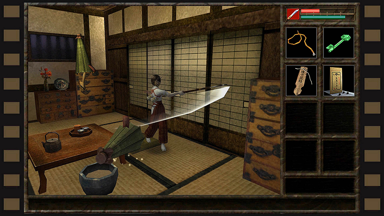
The premise of Kwaidan involves the classic hero-coming-of-age stuff, so we are off to a good start. The setting is rural Japan in the 1930s, so the scenery is interesting. You get to use three weapons: a sort of short spear or really long handled short sword, a magic grenade, and a mirror. So, we have two unusual weapons and one cool blade weapon; OK, not bad. You are a 19-year-old girl named Haruka who is starting training under your sensei, Shiro.
Unfortunately, the overall experience is not that great. What starts with a fine premise, interesting period visuals, and a classic horror/adventure game set-up ends with some really disappointing game mechanics, less-than-polished graphics, and audio bordering on annoying.
As I went through the tutorial for Kwaidan: Azuma Manor Story, I found out how awkward the game controls can be. When you start a new game, you have the option of using the “Origin” mode or “Modern” mode for controls. I tried the origin controls, and they are really unwieldy. I would advise not even bothering with them on the Switch. The modern controls are a bit more familiar for this gen’s gamers, but they’re still pretty bad.
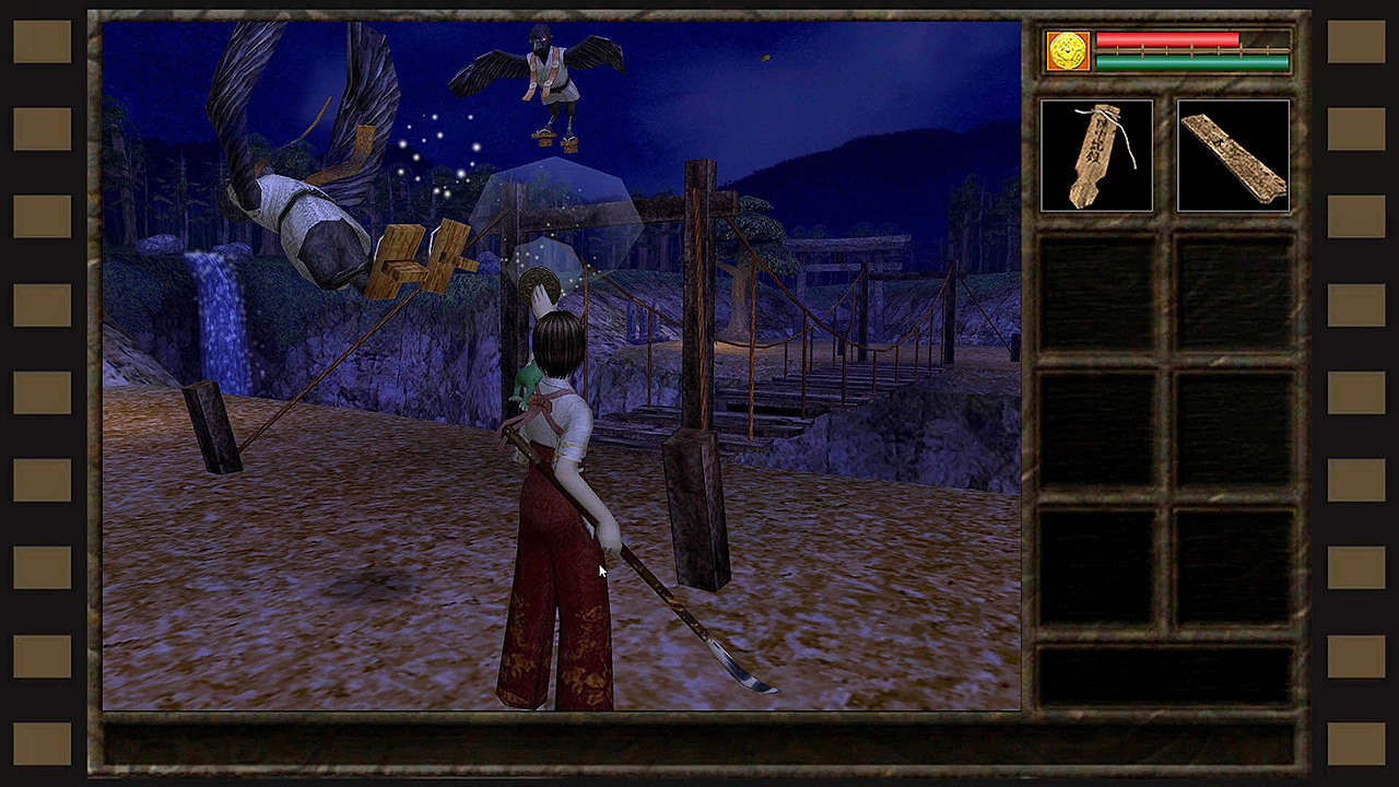
I’ll make note of a few oddities, starting with weapon selection. I mentioned three weapons earlier, but the hidden gem (as much a polished piece of concrete is a “gem”) is that each weapon is only good for one range of attack. Oh, no—not melee vs, distance, nothing so normal. Rather, the “grenade” is used against enemies from ground level to about knee high, the blade weapon is used against enemies from knee high to shoulder height, and the mirror is used against enemies from shoulder height and up.
Not only is there an odd height requirement for your weapons, you also need to use the Y button to toggle between weapons. If you are not sure about your selection or get a bit twitchy with the Y button, it can end badly for you in short order. If the weapons were simply assigned to X for high, Y for mid, and B for low attack, it would have been much better. As it stands, we’re left with a confounding weapon system.
Another inconvenience of play is item selection. When you walk up to something you need to pick up, you need to use the right Joy-Con to move a cursor over the object and, when the cursor changes from an arrow to a hand, use the Right button to select and pick up the object. As an aside, this little nugget o’ fun is why you have to use the X button to recenter the camera angle as you walk around (another annoyance, to be sure). To add insult to injury, if the cursor moves too fast for you, you can slow it down by pressing the R button. Using this and the right Joy-Con to do fine targeting is a bit on the awkward side; too bad you can’t use the touch screen for this task (you can’t use the touch screen to do anything, by the way).
To try to get used to all the odd mechanics, I would recommend going through the tutorial. This is how the game will start every time you die and have to start over (before a better save point). If you click on SKIP at the beginning of the tutorial, you can jump to the first battle with the snake demon and get going with the story. Once you start the tutorial, you can’t opt out, skip ahead, or in any other way hurry things along. With the lethargic pace of character movement, this can take a few minutes. To make your character run, you can use the A button with the Joy-Con, but it is more like a slow jogging pace.
During combat, you actually get a command to parry an attack. Not only do you avoid injury, you also regain a little “aura” (think mana). To parry, use the ZL button. Coincidentally (and oddly enough) this is the same button that you can hold down to walk backward.
If all the strange movement and attack commands leave you a little befuddled, you are not alone. The game controls could use a major overhaul to be more user friendly.
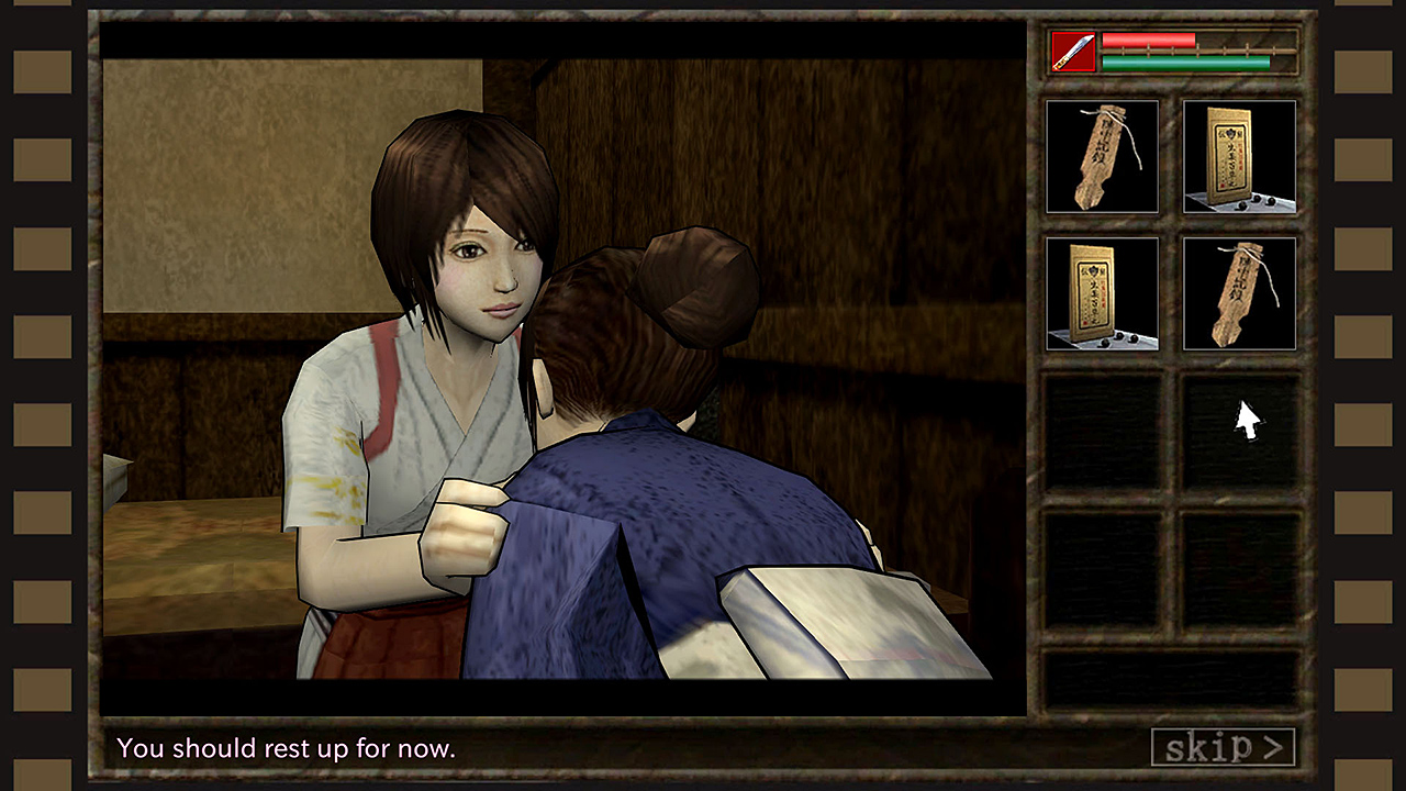
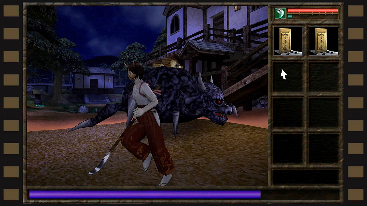
Other aspects of the game may also seem a bit dated or outmoded, but I didn’t really mind. The main action takes place on a 3:4 ratio window with a sidebar for your inventory of items. To fill the remaining space at the left and right sides of the screen, the game has what looks like the square holes used in motion picture film. This is actually an interesting touch and a nice point of distinction.
The visuals are not repelling, but they could use a little better finish. The overall look is similar to console games from about 15 to 20 years ago—not bad, but obviously clunky. What is worse is the audio track. There is no real soundtrack, and there are minimal background noises and sound effects. The ambient effects are monotonous, and are best experienced on very low volume.
I don’t enjoy being such a downer on a game, but I had high hopes based on the theme and story. That I was let down by the gameplay is a bummer. Kwaidan could have been so much better with a little control rearranging and a modicum of extra effort on the audio. This game is functional but frustrating. If it gets reworked to bring it more in line with the capabilities of the Switch, I would be happy to give it another try.
The post Review: Kwaidan: Azuma Manor Story (Nintendo Switch) appeared first on Pure Nintendo.
* This article was originally published here


Comments